
Previous Projects
I have worked on many projects demonstrating my quantitative skills. I have experience with Bayesian model fitting, high performance computing, data analysis of large data sets, highly technical problem solving, and Python and C programming.
I'll start with a quick summary of each project, then below will have more detailed descriptions.
- Measuring the Radii of Star Clusters - Using a Bayesian model, I measured the radii of star clusters seen by the Hubble Space Telescope, then fit the relation between cluster mass and radius.
- Numerical Simulations of Galaxy Formation - I ran a suite of simulations of galaxy formation on several supercomputers, then analyzed the outputs (over 60 TB) to determine how different modeling choices affect the properties of simulated star clusters.
- Improving the Computational Efficiency of Numerical Simulations of Galaxy Formation - I developed a method to modify the setup of galaxy formation simulations to improve their performance.
- Estimating the Redshift of Galaxy Clusters- I developed a method to estimate the redshift (a proxy for distance) of galaxy clusters using data that is inexpensive to obtain.
- Understanding Basketball Performance Data - I won a University of Michigan competition by investigating how the physical workload of UM basketball players correlated with game outcomes.
- betterplotlib - A Python library making matplotlib plotting simpler.
- A citation manager for astronomy - An application built using Python and SQL that allows astronomers to easily organize the literature relevant to their research.
Measuring the Radii of Star Clusters
When stars are born, most stars form along with many other newborn stars in what is known as a star cluster. These clusters contain anywhere from hundreds to millions of stars, and are some of the most beautiful objects in the night sky.
Since most stars form in clusters, measuring the properties of star clusters helps us understand the process of star formation. One of these key properties is the size of the cluster, quantified by its radius. The initial radius of the cluster is determined by the star formation process, but then the radius can change with time. Measuring the radius of star clusters of a range of ages helps us understand both how star clusters form and how they evolve. To help investigate these questions, I measured the radii of over 6,000 star clusters from 31 galaxies imaged by the Hubble Space Telescope (HST).
Since these clusters are in galaxies other than our home Milky Way galaxy, they are very far away and are only several pixels across, even when imaged by HST. Careful measurement procedures are therefore required to accurately measure their radii. In addition, star clusters are located within their host galaxies, which have their own complex internal structure. This can make it difficult to separate the light that belongs to the cluster from galactic contamination.
To measure the radius, I use a Bayesian method to fit a model that best reproduces the image of each cluster. I start with a commonly-used analytic light profile for star clusters, with free parameters that describe its position, total brightness, concentration, and ellipticity. I then subtract this model from the data and find the set of cluster parameters that minimize the residuals. I then calculate the radius of this best fit cluster model. An example of this procedure is shown below in Figure 1. The left panel shows a segment of an HST image with a star cluster at the center. The center panel shows the best fit model for this star cluster, and the right panel shows the residuals after subtracting the model from the data. There is no sign of the cluster in the residual image, indicating that the model was an excellent fit to the data.
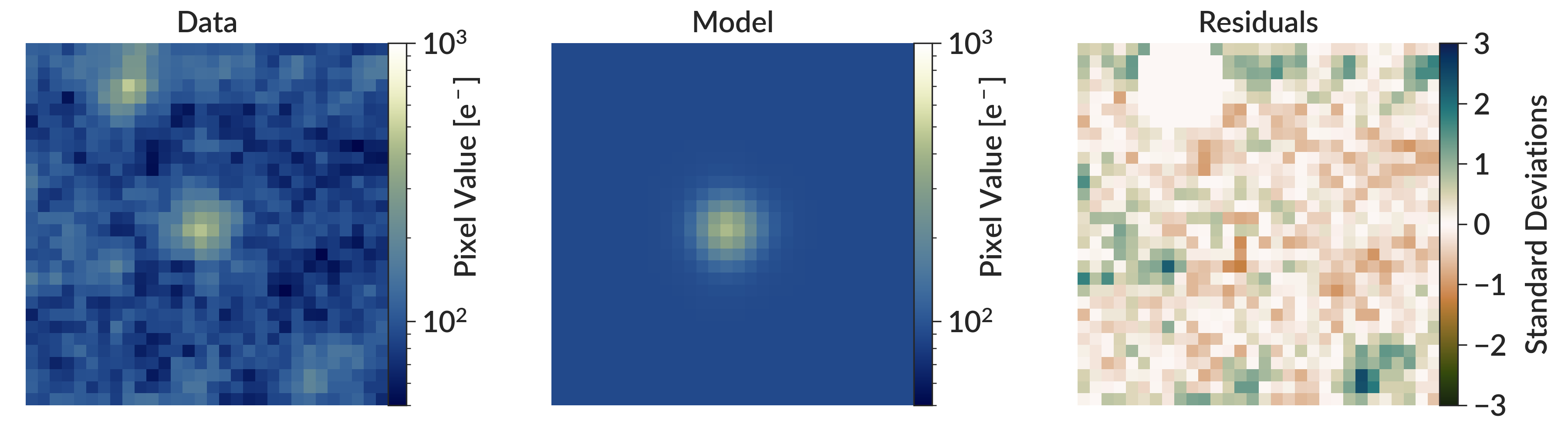
Figure 1 - An illustration of the measurement procedure I used to fit star cluster radii. The left panel shows a segment of an HST image with a star cluster at its center, while the middle panel shows the best fit model for this cluster. The right panel shows the residuals, calculated by subtracting the model image from the data and dividing by the pixel uncertainties (not shown). The best fit model is the one that minimizes the residuals.
Figure 1 also illustrates how this pipeline was designed to be robust against contamination from other objects near the cluster. In the top left of the data image, there is another cluster. Contaminating objects like these are automatically masked out so they do not contribute to the residual image. In the residual image, note how this other cluster does not appear. This ensures that the fit focuses only on the cluster of interest at the center of the image. The full details of the measurement procedure can be found in Section 2.4 of the peer-reviewed paper, which is also freely available on the arXiv.
With this method, I measured the radii of over 6,000 clusters. With this large sample of cluster radii, I started to investigate some properties of the distribution of cluster radii. Here, I will just discuss one of these results. Figure 2 shows the relationship between cluster mass and cluster radius. While there is significant scatter, more massive clusters tend to have larger radii than less massive ones. To quantify this relation, I fit it with a simple power-law model. As both the uncertainties in mass and radius are important to include in the fit, I used a method that minimized the orthogonal distance of the data points from the mean relation. This method also allowed me to quantify the intrinsic scatter of the relation.
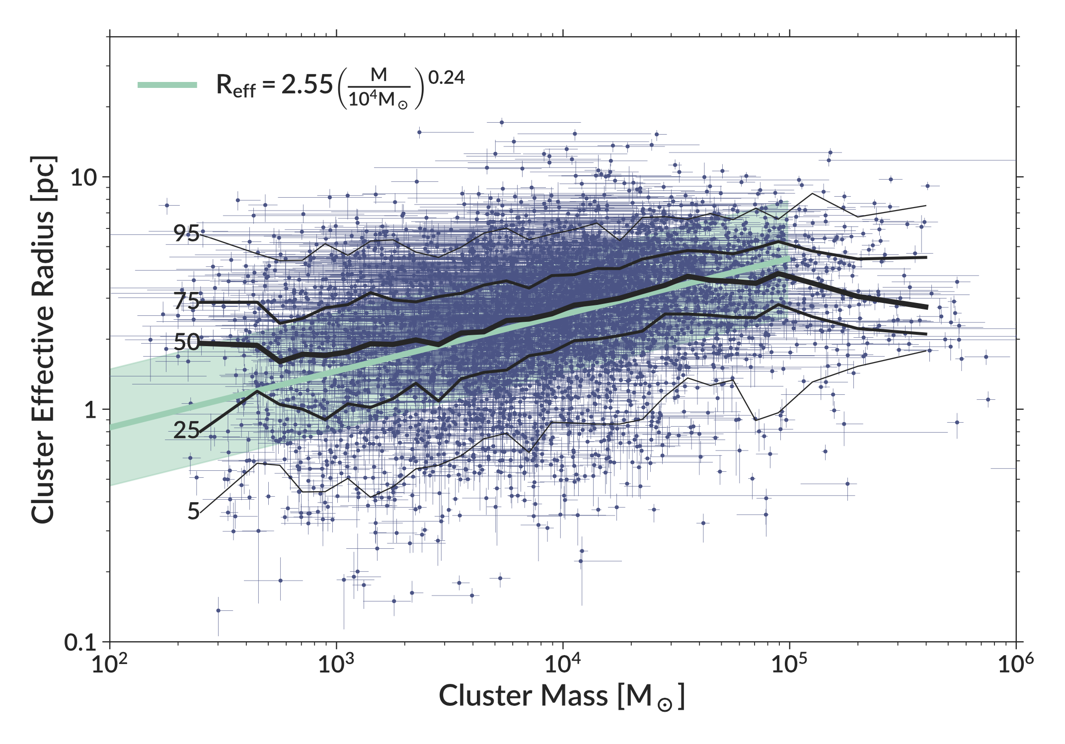
Figure 2 - The relation between cluster mass and cluster radius. The blue data points shows individual clusters and their errors. The black lines shows the percentiles of the distribution at a given mass (e.g. 50 shows the running median). The solid green line shows the best fit relation, with the green shaded region showing the intrinsic scatter (1 standard deviation).
While this simple model for fitting the mass-radius relation performs well, I also tested a hierarchical Bayesian model using MCMC that included a correction for any potential clusters that would have been missed by the original survey that found the clusters I used. See the appendix of the paper (link above) for the full mathematical details. This more complex model produced results very similar to the simple model while being orders of magnitude more computationally expensive, so I used the simple model for all results in the paper.
Numerical Simulations of Galaxy Formation
Modern astronomical observatories have provided enormous amounts of data, which astronomers use to test theories about how the universe works. But for this process to work, theoretical models need to make concrete, testable predictions that can be compared to what we see in the real universe. One of the main ways astronomers create these testable predictions is through simulations. All the ingredients of a given model are put into a numerical simulation (often run on a supercomputer), then the results of this simulation can be compared to the real universe to tell us how close the model is to reality.
As an example, theories of galaxy formation are commonly tested with numerical simulations. These simulations start with a region of the universe that is nearly uniformly filled with dark matter and cosmic gas. The equations of gravity and hydrodynamics are solved to determine how the universe evolves with time. As gravity draws the gas and dark matter together into galaxies, a set of rules determines where stars form within these galaxies. Once the stars do form, some explode as supernovae and reshape their surroundings. While of course there are many other details required to properly model galaxies, this basic picture does an excellent job of producing simulated galaxies that look very similar to galaxies in the real universe.
During my Ph.D., I ran my own suite of galaxy formation simulations. I started by adding some features to the existing 20-year-old simulation code, which is primarily written in C. These improvements allowed me to model more aspects of galaxy formation, both improving the realism of the simulations and opening up additional ways to compare the simulations to observations. I then ran a large suite of simulations on several different supercomputers, including Pleiades, Stampede2, and Frontera (the fastest supercomputer on a university campus in the world). Across these machines, I was awarded over 15 million CPU hours to run these simulations. The flagship simulations in this suite ran for approximately a year.
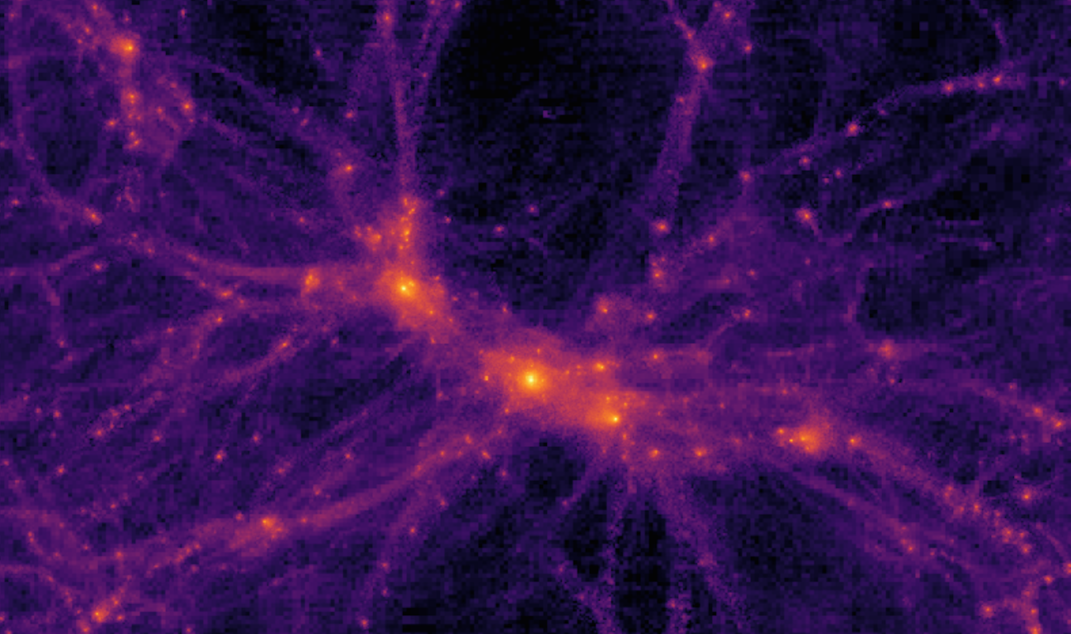
Figure 3 - A visualization of one of my simulations, showing the distribution of dark matter. The central object hosts a Milky Way-sized galaxy.
With these simulations, I investigated how different modeling choices affect the properties of the star clusters that form within galaxies. To do this, I created an automated pipeline to process all simulations (which totaled more than 60 TB of volumetric data), extracting key properties of the star cluster populations in individual galaxies as well as how these properties changed over time. While I won't go into the full set of results here (see the paper for more details), one of the big picture results is that some modeling choices change star cluster properties without changing the global properties of their host galaxies. Many models of galaxy formation can produce realistic galaxies, but not all can produce reasonable star cluster populations. My work emphasizes the importance of considering these properties when constraining models of galaxy formation.
Improving the Computational Efficiency of Numerical Simulations of Galaxy Formation
As described in the previous section, numerical simulations are a powerful tool for understanding galaxy formation. However, these simulations are extremely computationally expensive. As an example, my simulations ran for nearly a year on the Stampede2 supercomputer, even when running on 384 CPU cores in parallel. Improving the performance of these simulations helps science progress more quickly. A key way to improve the performance is to improve the parallelization, allowing the code to effectively utilize more CPU cores.
The details of how to do this depend on the specific simulation setup and code used, and can be quite technical. In my case, the simulation setup was giving the code difficulty. I used a setup known as a "zoom-in" initial condition, where a very large volume of the universe contains a small region of interest, often containing only one or two galaxies. The full simulation box is simulated at very low resolution, while the galaxy itself has much higher resolution that is required to accurately model galaxy formation.
To parallelize the workload in runtime, the code assigns different regions of space to different CPUs. In this case, the very large volume of the entire simulation made it difficult for the code to evenly split the workload, which was almost entirely contained within the small region hosting the galaxies. This resulted in many CPUs with very little to do, making the code very inefficient and preventing it from scaling to a higher number of CPUs.
To ameliorate this problem, I developed a method to regenerate the initial conditions of the simulation, significantly shrinking the box size. This allowed the code to divide the workload more efficiently, improving the speed of the simulation by up to a factor of two. Importantly, this method preserved the properties of the galaxies in the central region, which are often carefully selected to be similar to the Milky Way. This method allowed my simulations to progress faster than they would have otherwise, and without this speedup the results I discussed in the previous section would not have been possible.
The paper describing this method in detail can be found here.
Estimating the Redshift of Galaxy Clusters
Galaxy clusters are collections of hundreds to thousands of galaxies, and are the largest objects in the universe (note that galaxy clusters are very different from star clusters). Galaxy clusters are found throughout the universe, and astronomers are constantly working to find more. Methods to detect clusters cannot easily determine their distance, which must be determined before clusters can be analyzed in detail. As there are large number of clusters to analyze, we need an inexpensive method to estimate their distance.
I developed such a method to estimate the redshift (a proxy for distance) of galaxy clusters using only images in two bands. This method utilizes the galaxies in the cluster that belong to the "red sequence," which is a group of galaxies that have stopped forming stars. The typical color of this red sequence depends on the redshift of the cluster. My method identifies this red sequence, then determines the redshift that matches the color of this red sequence. This method only requires images of the cluster in two bands, which is much less expensive than other methods, allowing it to be used on a large number of galaxy clusters.
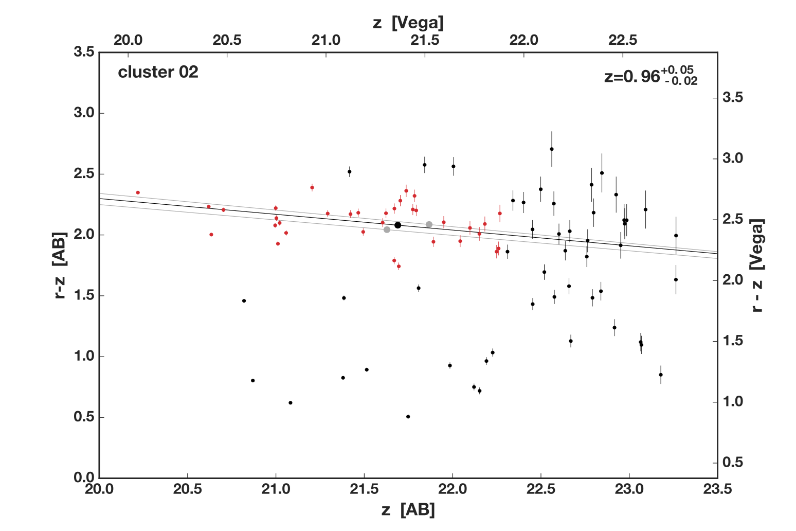
Figure 4 - An example of how the method estimates the redshift of a galaxy cluster. The x axis shows the brightness of galaxies in the cluster (increasing to the left), while the y axis shows color (bluer on the bottom, redder on the top). Data points show the color and brightness of galaxies in the cluster. Points colored red are identified by my code as red sequence members. The black line shows the expected red sequence at the best-fit redshift of 0.96, while the grey lines show the uncertainty range of this estimate.
Understanding Basketball Performance Data
In March of 2020, I entered a competition called "Basketball Data Madness Challenge" run by the University of Michigan Institute of Data Science. This competition used data from accelerometers worn by players on the University of Michigan basketball team during all team activities. The goal was to identify how this accelerometer data predicted game dynamics. My team, composed of me and three other astronomy Ph.D. students, looked at how various measurable outcomes of games (such as 3 point attempts, fouls, turnovers, etc.) depended on how hard the players worked before the games and during the games. My team was one of the winners in this competition.
As this competition only lasted two weeks and started right as COVID-19 was cancelling events across the US, my team kept it simple. We calculated the Spearman correlation coefficient between different measures of player workload data and various game outcomes. We then used bootstrapping to determine which correlation coefficients were significantly different from zero. Figure 5 below shows our results. Dark blue (yellow) squares show correlations (anticorrelations) that are significant at more than 2 sigma.
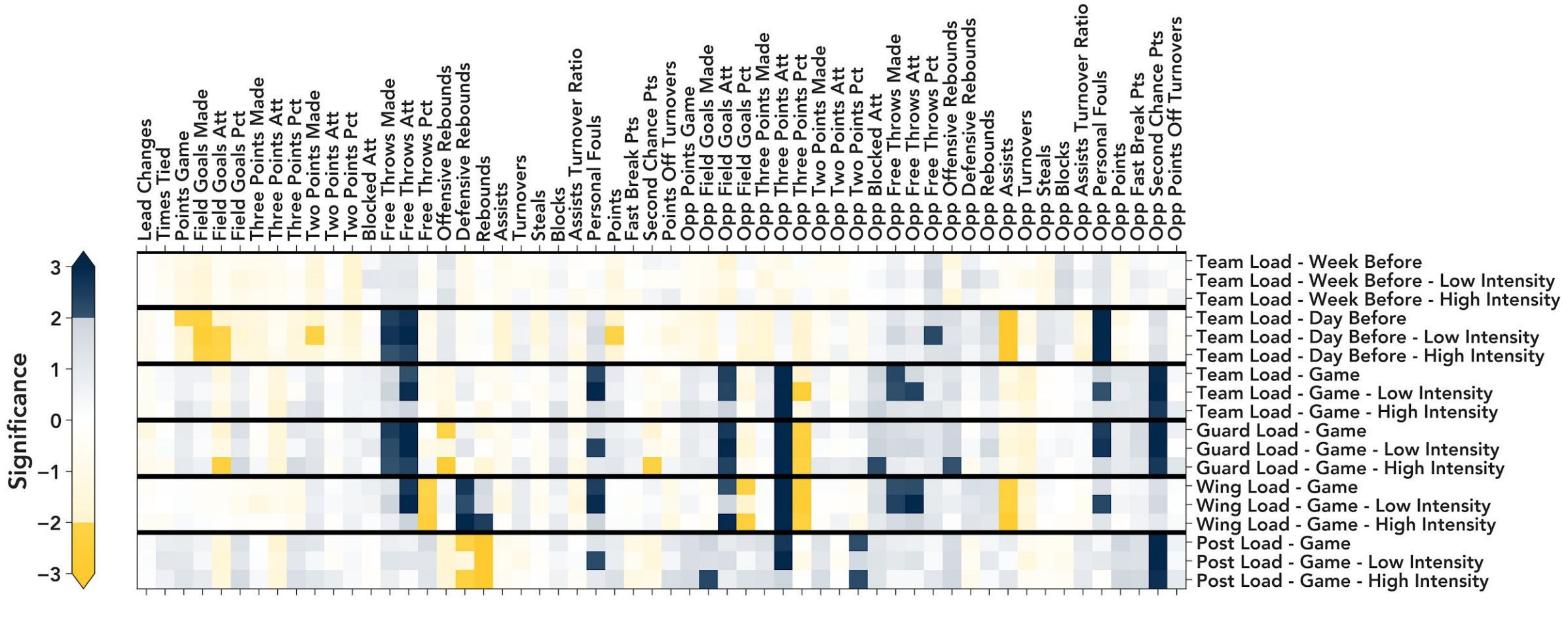
Figure 5 - The significance of various correlations between basketball player workload data (right) and game outcomes (top). Dark blue indicates statistically significant correlations, while dark yellow indicates anticorrelations.
We found a few interesting outcomes, a few of which I'll highlight here. First, as post players work harder during the game, they get less defensive rebounds. We interpreted this as post players getting drawn away from the rim on defense, making them work hard to get out there and stopping them from getting rebounds. Second, the harder the team works during the game, the more three point attempts the opponent shoots, but at a lower percentage. We interpreted this as the team playing hard on defense, forcing the opponent into bad shots from the perimeter, as nothing else is available. Finally, we found that the workload of players the week before the game had no effect on game outcomes. Whether the team had a hard week or an easy one, game outcomes were similar.
betterplotlib
Matplotlib is one of the most popular libraries for making plots using Python. It is an excellent tool, but sometimes the syntax can be obscure or hard to remember. To make plotting easier and more beautiful, I made the betterplotlib library. It is basically a wrapper around matplotlib to make tricky things easier and easy things more beautiful. All the plots on this page have been made using betterplotlib.
A citation manager for astronomy
Staying up to date on the literature is an important part of being an astronomer, and this leads to a large number of papers that astronomers need to organize. Existing tools like Mendeley and Zotero do this, but are not specific to astronomy. I created a similar program designed for astronomers.
This application is a Python program with a GUI built with PySide2, and uses an SQL database to hold the list of papers entered by the user. Users can simply provide a link to a paper on the arXiv or ADS (the dominant library portal for astronomers), and the application obtains all the relevant bibliographic information. Users can also assign tags to organize papers into groups. The video below shows a screenshot of the application in action.